Label
LEED Gold
Minergie Standard
GreenProperty
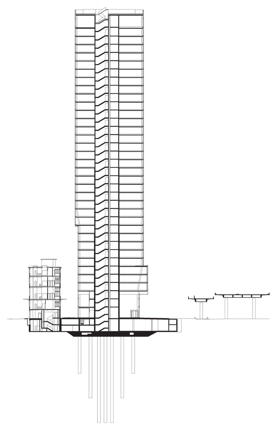
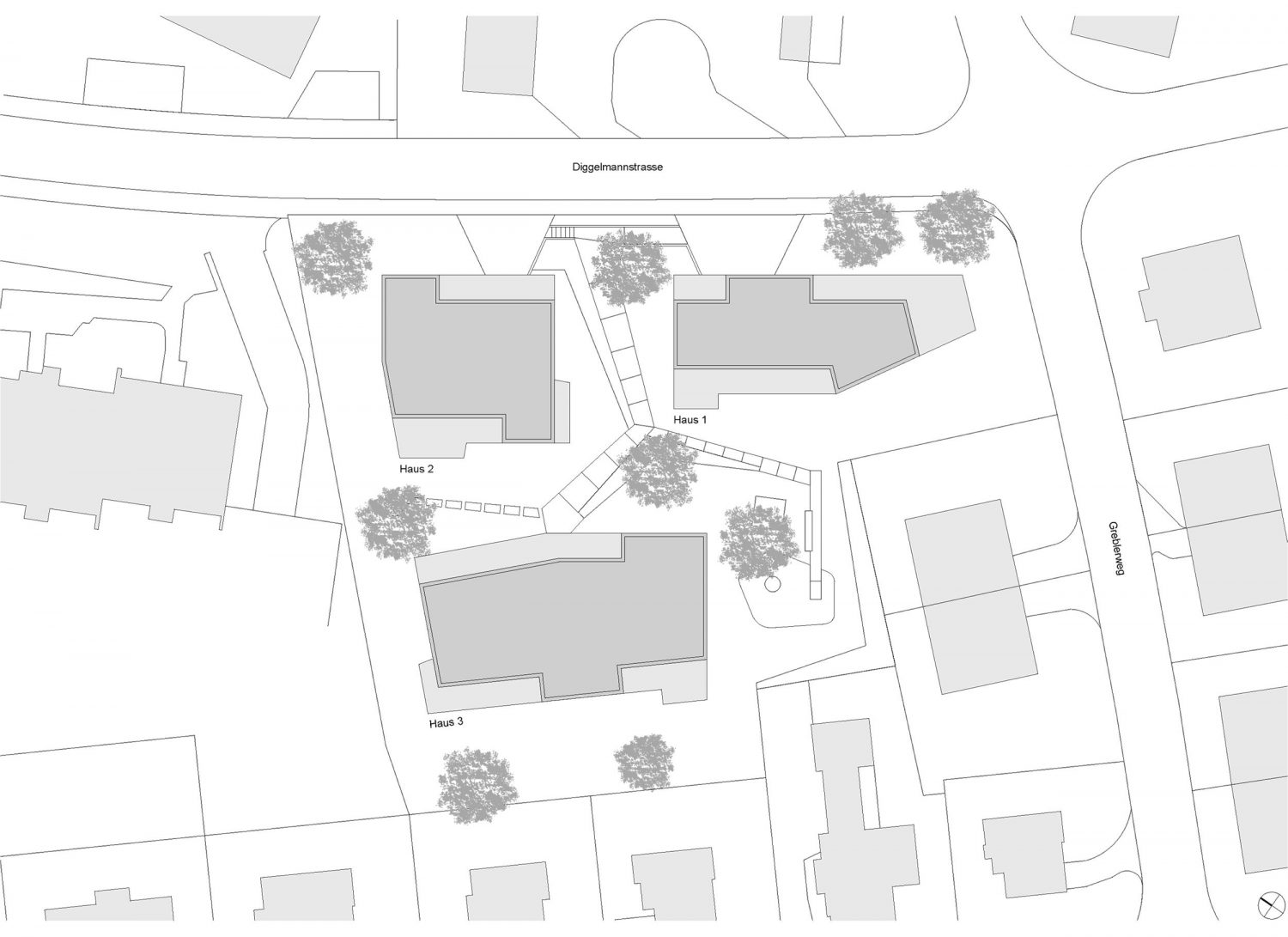
Gross Floor Area
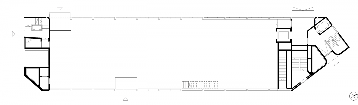
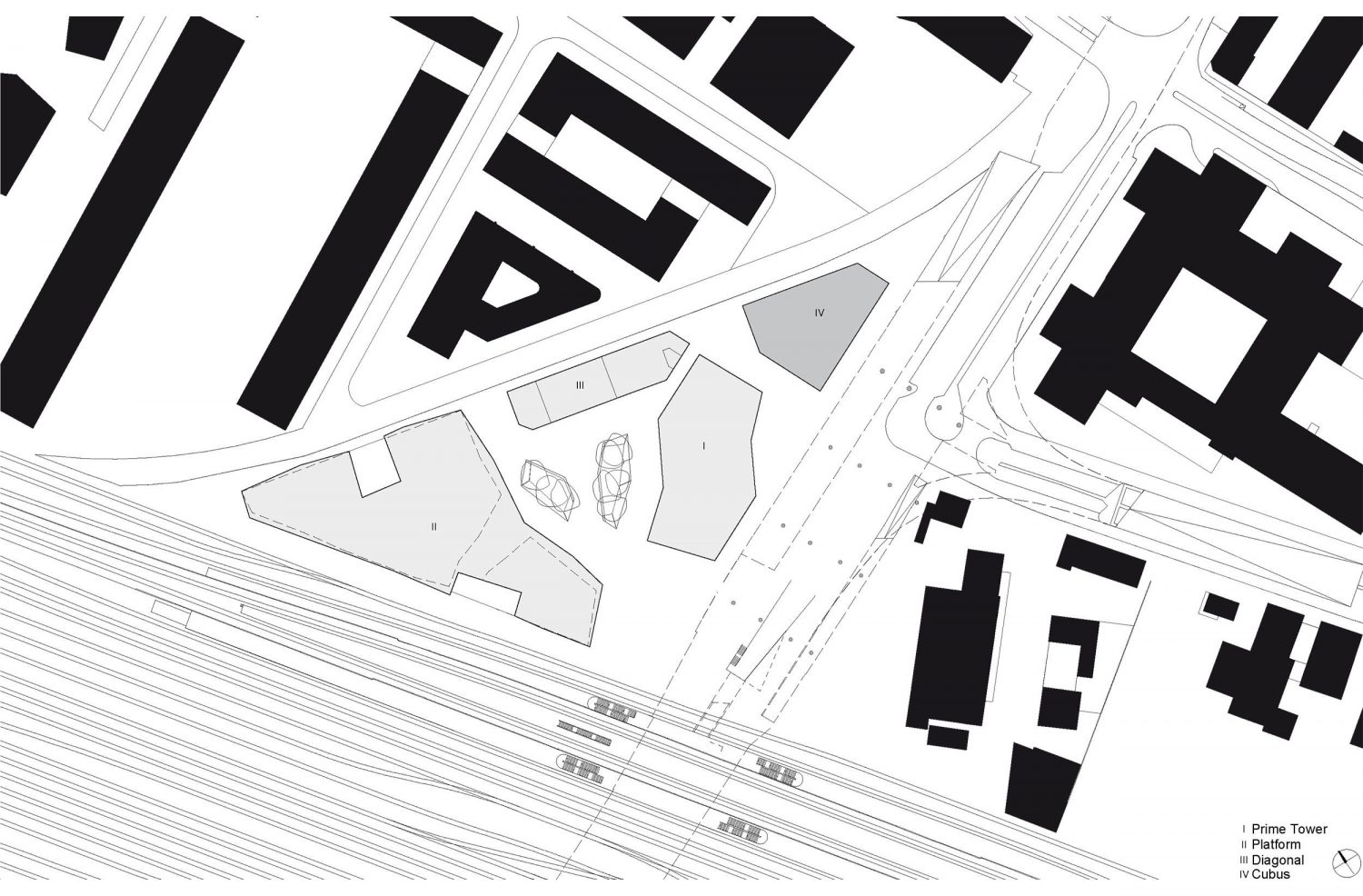
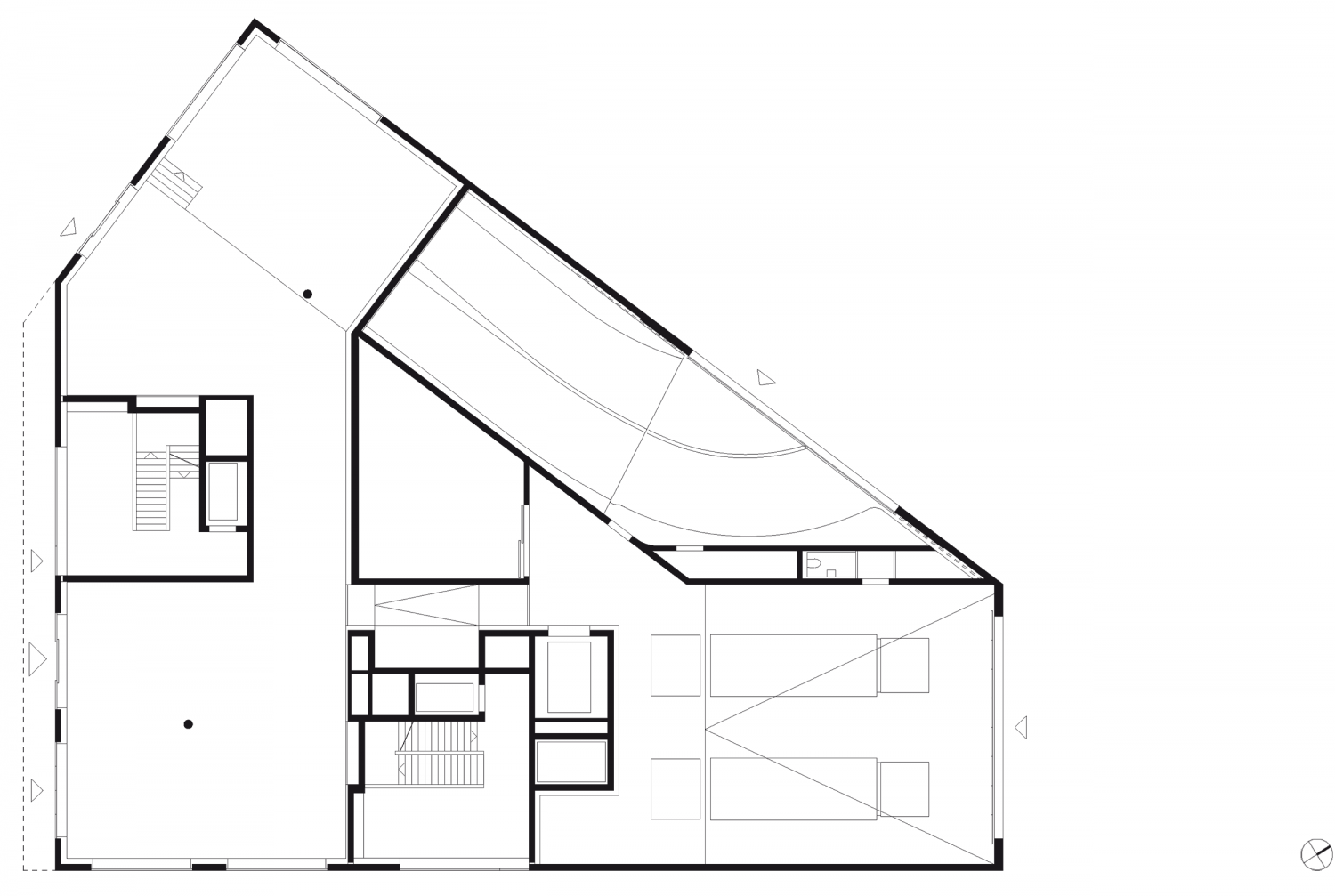
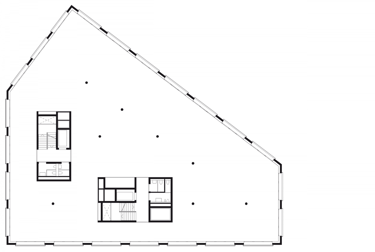
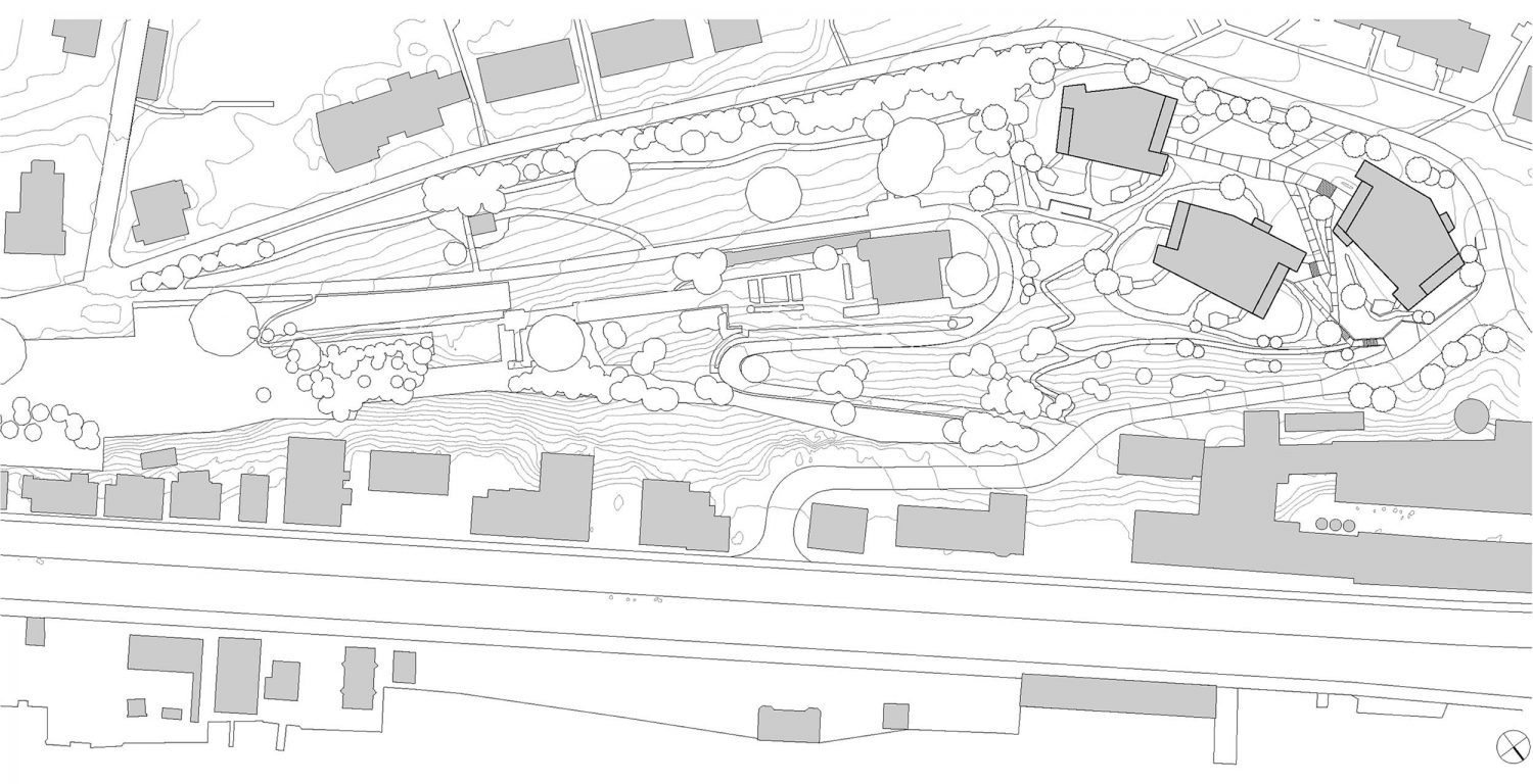
Total Prime Tower with Annex buildings: 73‘830 m2
Prime Tower: 53‘461 m2
Team GG
Planning/Construction: Annette Gigon, Mike Guyer, Stefan Thommen (Team Manager), Christian Maggioni (Deputy Team Manager), Christoph Rothenhöfer (Project Manager until 2007), Pieter Rabijns (Project Manager from 2007), Alex Zeller, Urs Meyer, Franziska Bächer, Raffaella Bisceglia, Armin Baumann, Karin Winklmann, Roberto Outumuro, Rafael Schmid, Martin Bischofberger, Leander Morf
Competition: Annette Gigon, Mike Guyer, Stefan Thommen
Total Contractor
ARGE Prime Tower
Losinger Construction AG and Karl Steiner, Zurich
Landscape Architecture
Schweingruber Zulauf Landschaftsarchitekten, Zurich
Cost Planning/Scheduling
Building Project/General Contractor Submission: b+p baurealisation ag, Zurich
Structural Engineer
Competition (C): Dr. Schwartz Consulting AG, Zug
Submission (S): Dr. Schwartz Consulting AG, Zug and Dr. Lüchinger + Meyer AG, Zurich and Freihofer & Partner AG, Zurich
Execution (E): Walt + Galmarini AG, Zurich with Dr. Schwartz Consulting AG, Zug, Dr. Lüchinger + Meyer AG, Zurich, Bänzinger Partner AG, Richterswil, Freihofer & Partner AG, Zurich
Electrical Engineer
S: IBG Graf AG, St.Gallen
A: Hefti Hess Martingnoni, Zürich
Heating/Cooling
S/E: PB P. Berchtold, Sarnen
Ventilation Engineer
C/S: Waldhauser AG, Münchenstein
E: Hans Abicht AG, Zurich
Plumbing
S: PB P. Berchtold, Sarnen
E: GRP Ingenieure, Rotkreuz
Sprinkler Consultant
S: PB P. Berchtold, Sarnen
E: GRP Ingenieure, Rotkreuz
Facade
C/S: gkp fassadentechnik ag, Aadorf
E: Reba Fassadentechnik AG, Chur
Furnishings
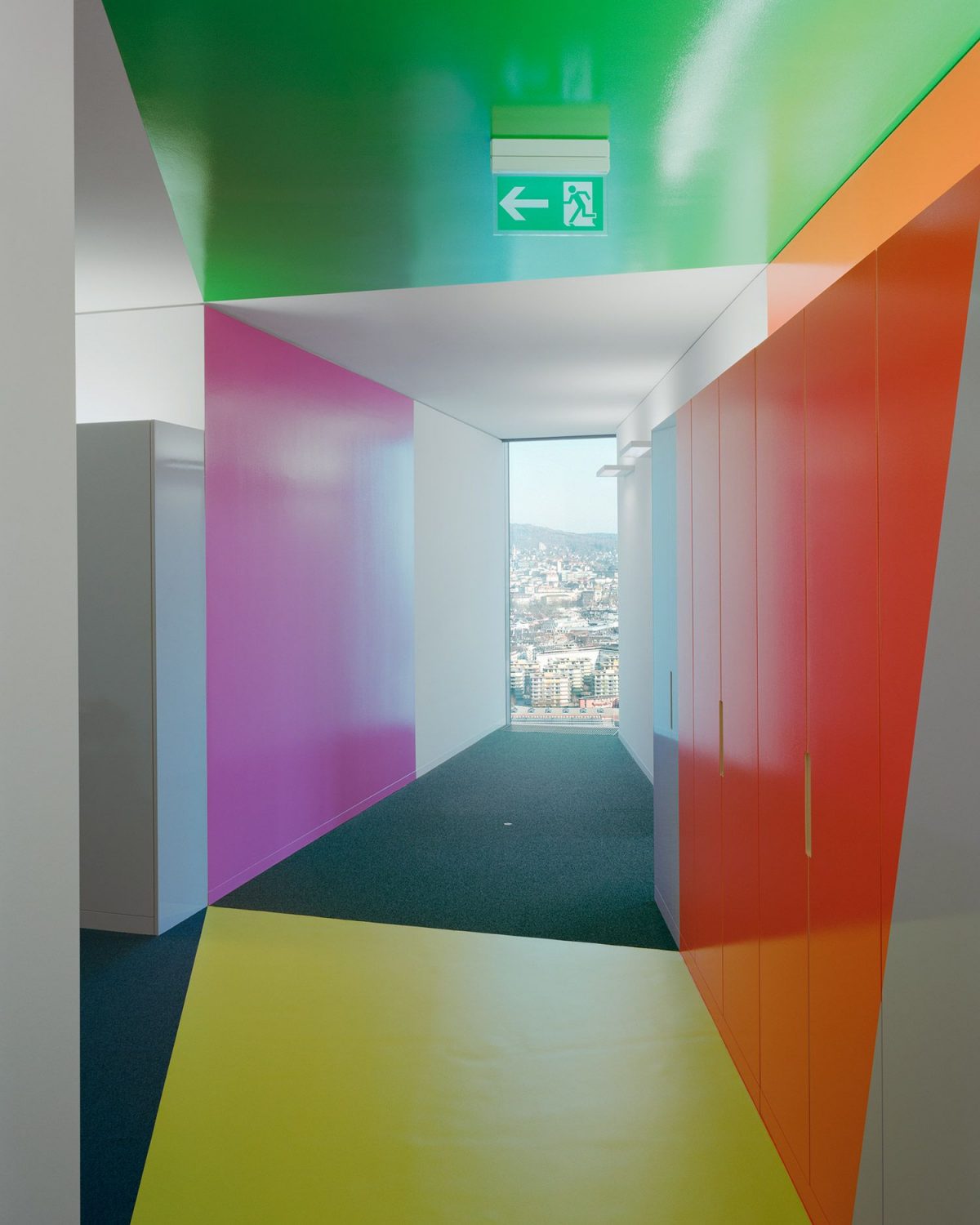
Gigon / Guyer Architects with C/S: Studio Hannes Wettstein, Zurich
Signage
Integral Ruedi Baur Zürich GmbH
Art within Architecture
Adrian Schiess, Zurich and Mouans-Sartoux, France
Harald F. Müller, Öhningen, Germany
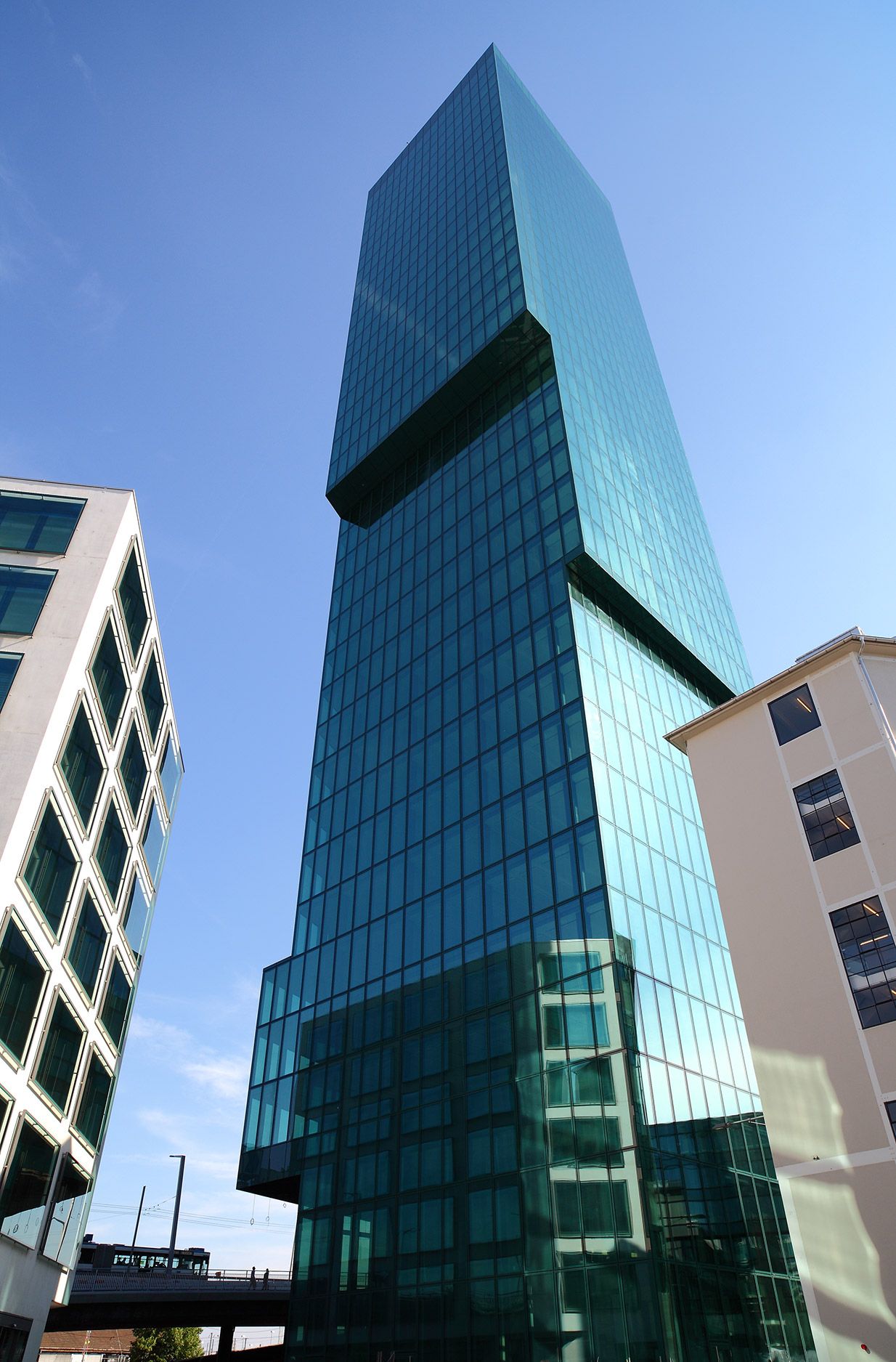
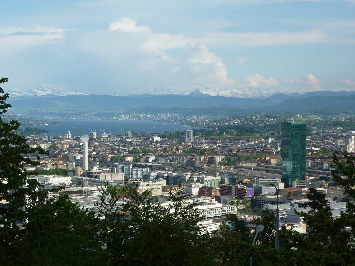
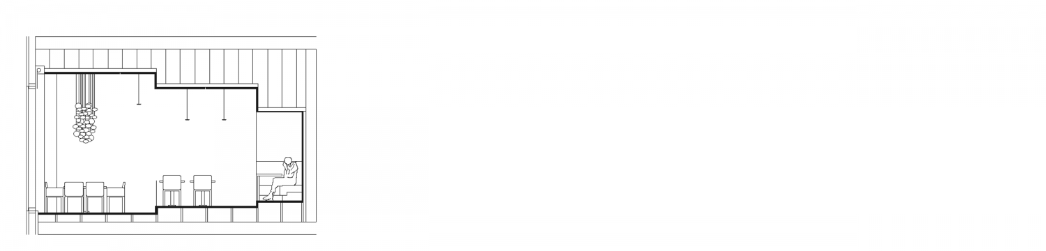
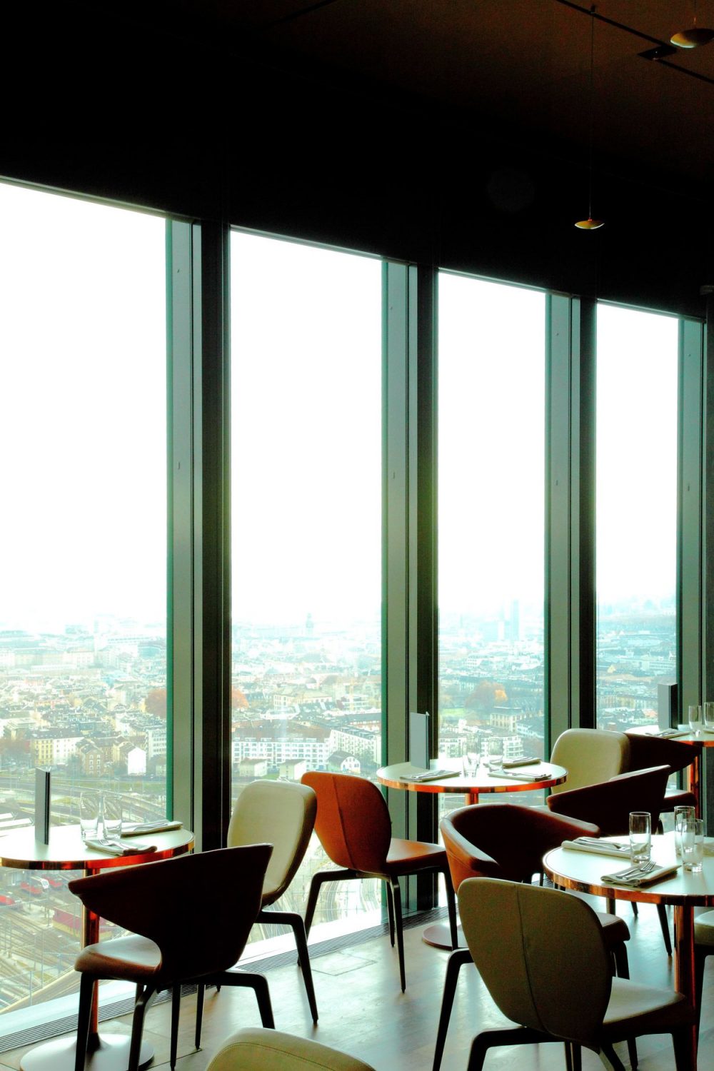
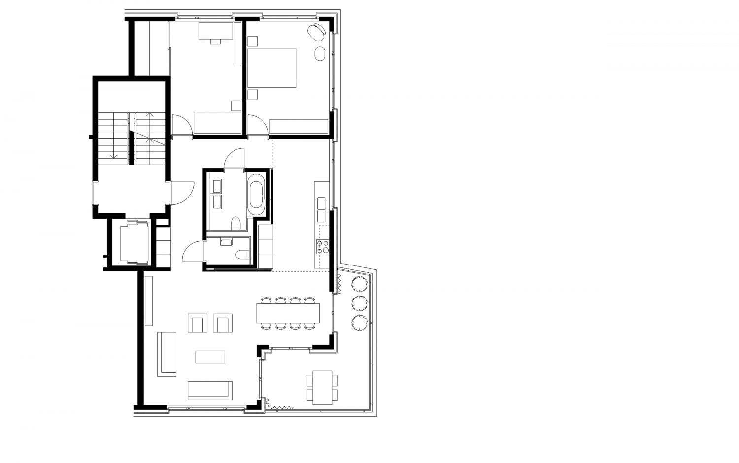
Photos
© Walter Mair
© Thies Wachter
Maagplatz: © Roman Keller
Awards
Auszeichnung für gute Bauten der Stadt Zürich 2011–2015